







Point-and-figure (P&F) charts predates candlestick charts and was popular in the 1920s before the advent of computers.
Investors would use the closing stock price found in daily newspapers to update their charts on graph paper.
This worked great because they don’t need to do much redrawing on a daily basis.
They would just add some X’s (bullish price move) or some O’s (bearish price move) in a graph paper square box if needed.
On days where price did not change much, they didn’t even need to make any change to the chart.
The chart is only updated when there is a significant price move.
In this way, the resulting chart automatically would have filtered out the market noise.
Everything that shows up on the chart is significant.
Contents
- Point And Figure On StockCharts
- Buy/Sell Signals In Point And Figure Charts
- How Options Traders Can Use Point And Figure Buy And Sell Signals
- Relating P&F Charts To Candlestick Charts
- Scaling Method
- Reversal Setting
- Trendlines In Point-And-figure Chart
- FAQ
- Final Thoughts
Point And Figure On StockCharts
StockCharts does a solid job rendering P&F charts considering that this feature is available for free without requiring a paid subscription.
Let’s look at a P&F chart there by selecting “Point & Figure” and typing MSFT (the ticker symbol for Microsoft stock):
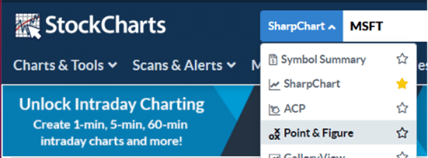
You will get the default settings of a daily chart using the Traditional scaling method with a three-box reversal…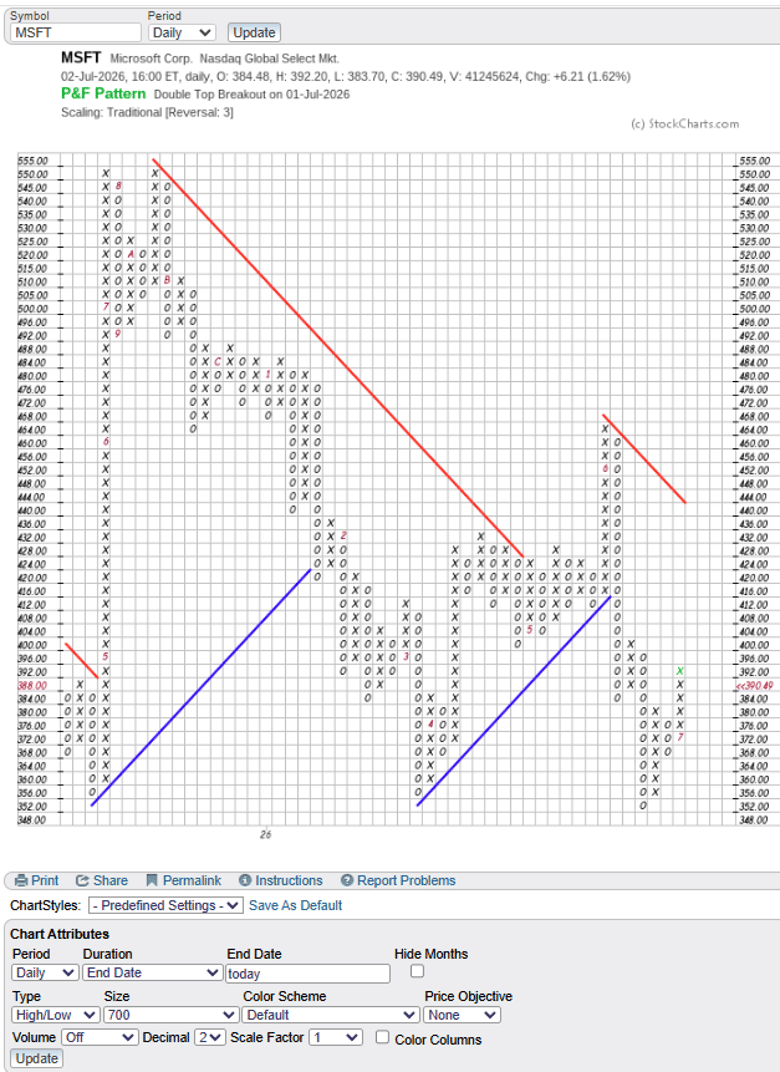
 These settings shown are good ones to stick with when you are first getting started.
The daily timeframe is the timeframe that this was designed for.
Afterall, the newspaper only printed the stock prices once a day.
If you accidentally changed something, you can get back the default settings by selecting the predefined “SCC Default”: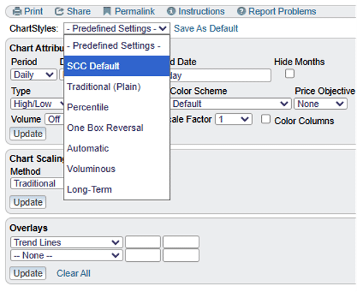 In the Overlays section (screen shot above), the blue and red trendlines are set to be automatically drawn.
The only settings you might want to change for now is the pixel size to be 1000…
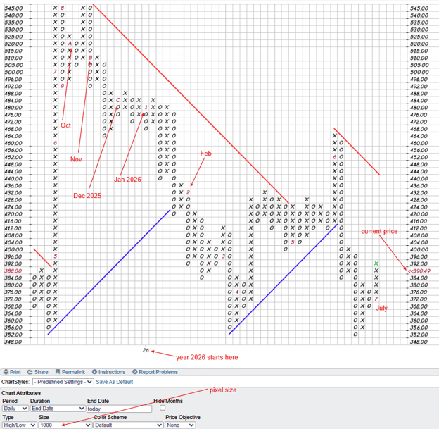
So that you don’t have to squint to see the numbers and letters, which represent the months of the year.
The number 1, 2, 3, …, to 9 represents January, February, March, …, September.
The letter A represents October, because investors are not able to fit “Oct” into one tiny square of a graph paper.
Letter B is November and C is December.
The “26” at the bottom of the chart tells you that those months belong in the year 2026.
The vertical axis shows the price of the stock.
MSFT current price is at 390.49.
The horizontal axis is not in any fixed unit of time.
A new column is drawn to the right when volatility of price movement dictates, not by the passage of time.
Hence the P & F chart highlights significant price moves regardless of time.
Time is taken out of the picture.
If the stock price moves sideways without any significant up and down movement, then a lot of time could pass before the chart is updated with another X or O.
If price is making rapid up and down price swings, then a lot of new columns could be added in a short amount of time.
Each column represents a price swing.
A column of X’s represents a price swing up, or an up trend.
A column of O’s presents a price trend down.
A column can only contain either X’s or O’s, and never both.
When a trend reverses, a new column with the alternating letter is formed.
Hence, you will never see two columns of X’s next to each other.
Buy/Sell Signals in Point and Figure Charts
Take a look at the July column of X’s in the above MSFT chart.
MSFT started July at $373 (because it closed at $373 on June 30th).
The “7” took up a square on where an X would have been.
And as the price of MSFT moved up in July, more and more X’s were added to the squares above until it reached $392 at the close of July 2nd.
We also see that this column of X surpassed the previous column of X.
That is a buy signal.
A sell signal is when a column of O goes below the previous column of O’s.
How Options Traders Can Use Point and Figure Buy and Sell Signals
For options income traders, the P&F buy and sell signals provide a directional filter that can improve strike selection and entry timing.
A P&F buy signal, where a column of X’s surpasses the previous X column, confirms an uptrend in progress.
For a bull put spread trader, this is an objective confirmation that the underlying is trending higher, making an OTM short put position more likely to expire worthless.
The P&F signal removes the subjectivity of “does this chart look bullish?” and replaces it with a clear, rule-based answer.
Conversely, a P&F sell signal — a column of O’s dropping below the previous O column — provides objective bearish confirmation for bear call spread entries or for avoiding new bullish positions entirely.
The trendline break is equally useful: when a rising blue trendline is broken by a column of O’s, that’s a clear signal that the bullish trend has ended, and any open bull put spreads should be reviewed for early exit.
Want to Combine Technical Analysis With Systematic Options Income Trading?
P&F charts are one of the technical tools that can improve your strike selection and directional filters for income strategies like bull put spreads, iron condors, and covered calls.
Options Income Mastery covers both the technical and structural elements of a complete options income trading approach.
Learn more about Options Income Mastery →
Relating P&F Charts To Candlestick Charts
The last column of X’s showed MSFT rallied from $373 to $392.
The column of O’s before that showed that MSFT dropped from $380 to $367.
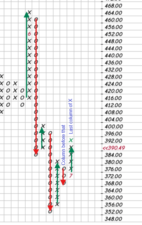 I have drawn several up and down swings in the above P&F chart.
In the first green up arrow, the X’s ran up from $415 to $466 and there was a “6” in the midst of that column of X’s.
The “6” is when the month of May turned into June.
The month of May closed with MSFT at $450.
And the price continued on June 1st to reach a high of $466.
We can see how that up swing corresponds to the candlestick chart below…
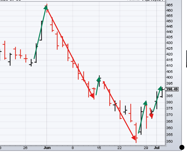
Instead of diagonal price swings across time in candlesticks, the P&F shows price swings up and down as columns of X’s on O’s respectively.
Scaling Method
Using the “Traditional” method in chart scaling means that StockChart would use the appropriate box size based on the asset price.
Box size is how many points the stock must move before a new X or an O is drawn.

MSFT falls into the asset price range of $200 to $500 and therefore uses a box size of 4 points.
That is why the vertical price scale on the MSFT P&F chart is in increments of $4.
Stocks with a price range from $100 to $200 would use a box size of 2 points.
Price range from $20 to $100 uses a 1 point box size.
And so on.
StockChart’s charting school has the full table.
If you set the scaling method to “User Defined”, then you would have to specify the box size yourself.
The scaling method “Dynamic ATR” uses box size based on average true range.
This might seem to make sense at first, until you realize that it means the box sizes of the chart will not be consistent and will vary from day to day.
Best to stick with Traditional for now.
Reversal Setting
What determines a change in trend is the reversal number shown next to the “Traditional” Chart Scaling settings (see setting screen shot above).
The consensus among practitioners is to keep this reversal setting to “3”.
A 3-box reversal means that MSFT requires a 12 point move in the opposite direction to be considered a reversal.
Because 3 times the box size of 4 points equals 12 points.
Let’s look at the down move corresponding to these three O’s in this column…
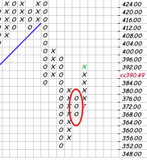 The price went from $380.50 down to $367.45…
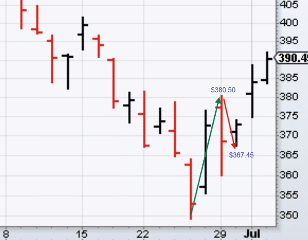
This drop of $13.05 qualifies as a reversal because it is greater than a 12-point move.
So those three O’s appeared in the column at the same time.
With a 3-box reversal setting, the smallest column of X’s and O’s seen on the chart is 3 boxes.
With our default P&F setting set to “High/Low” of the day instead of “Close”, there are rules as to whether we use the high or the low of the day when determining how to draw the X’s and O’s.
For each daily session, either the high or the low will be used (but not both).
It is possible that neither high nor low is used.
When the current column is an X-column (rising):
- If the high is sufficient to add another X, plot the new X(s) and ignore the low.
- If the high is not sufficient to add another X, but the low triggers a three-box reversal, start a new O-column using the low.
- If the high does not add another X and the low does not trigger a three-box reversal, ignore both the high and the low.
The converse applies when the current column is an O-column.
Trendlines In Point-And-figure Chart
Since columns represent trends (up or down), the trendlines in P&F charts are really trends of trends.
In the below chart, look at the blue trendline that starts at a swing low of $355 sometime in March (because it is between the “3” and the “4”):
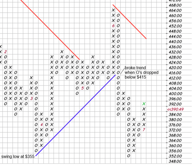
Trendlines are always at 45 degree angles because each square in the graph paper must be squares.
If a charting platform distorts the boxes such that they are rectangles, then they don’t know how to render P&F charts as they should be.
Tendlines continue until they hit another column of letters.
That column is said to break the trendline.
In the above, we see that the blue trendline was broken by the downtrending column of O’s when the O’s dropped below $415 in price.
See how the price did break the trendline when it dropped below $415 in the candlestick chart…
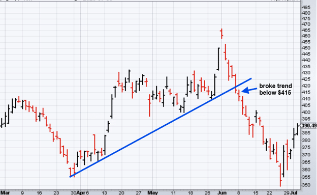
Trendlines drawn on P&F are very objective in that there is only one way to draw and interpret them – so much so, that computers can draw them easily with fixed rules.
Trendlines drawn on candlesticks are very subjective where different people can draw up different lines.
FAQ
Is StockCharts Free for Point-and-Figure Charts?
Yes — StockCharts provides Point-and-Figure charts on its free plan, which is one of the reasons it’s the recommended platform for P&F analysis.
The default settings, automatic trendline drawing, and traditional scaling method are all available without a paid subscription.
Some advanced features like additional overlays or extended data history may require a paid plan.
What Is the Difference Between a Box Size and a Reversal Number?
The box size determines how many points the stock must move before a new X or O is added to the chart.
For MSFT (priced between $200 and $500), the traditional box size is 4 points.
The reversal number determines how many boxes the price must move in the opposite direction before a new column is started.
With a 3-box reversal, MSFT needs to move 12 points (3 × 4) in the opposite direction before the trend is considered reversed and a new column begins.
Why Are P&F Trendlines Always at 45 Degrees?
Because the grid squares on a P&F chart are always equal in height and width — each box represents the same dollar move up or down.
A 45-degree trendline therefore means that for every box the chart moves to the right (one new column), it also moves one box up or down in price.
This creates a consistent, objective trendline that doesn’t depend on the chart’s time scale — unlike trendlines on candlestick charts where the angle depends on how you compress or expand the time axis.
How Do I Identify Support and Resistance on a P&F Chart?
Support and resistance on P&F charts are identified by looking at the levels where previous columns of X’s peaked (resistance) or where previous columns of O’s bottomed (support).
When a new column of X’s breaks above a prior X column’s peak, that’s a buy signal — the prior resistance has become support.
When a column of O’s drops below a prior O column’s low, that’s a sell signal.
These levels are the same high-probability price zones that options traders can use for strike selection on credit spreads.
Can P&F Charts Be Used for Options Strike Selection?
Yes — and this is one of their most practical applications.
A P&F support level (where O columns have previously bottomed) can serve as a technical basis for placing the short put strike of a bull put spread.
If price has respected that level multiple times on the P&F chart, it represents a high-probability support zone.
Similarly, P&F resistance levels can guide bear call spread strike selection.
The objectivity of P&F trendlines and signals makes them particularly well-suited to systematic options income trading where you want rules-based entry criteria.
Final Thoughts
Point-and-figure charting is becoming a lost art, which is a shame, because it offers something candlestick charts genuinely cannot: a completely noise-free view of significant price moves, with objective trendlines that remove the subjectivity that plagues most technical analysis.
We’ve covered the foundations here — how the chart is constructed, how to read buy and sell signals, how the traditional scaling and reversal settings work, and how to interpret the trendlines StockCharts draws automatically.
For options traders, the key practical application of P&F charts is in identifying directional bias before placing a directional income trade.
A bull put spread entered when the P&F chart is in an active X-column above a rising blue trendline has a higher-probability technical setup than one placed without any directional confirmation.
The objectivity of the P&F trendline makes it particularly well-suited to systematic traders who want rules-based entry criteria rather than subjective chart interpretation.
We hope you enjoyed this article on reading Point-and-Figure charts.
If you have any questions, please send an email or leave a comment below.
Trade safe!
Disclaimer: The information above is for educational purposes only and should not be treated as investment advice. The strategy presented would not be suitable for investors who are not familiar with exchange traded options. Any readers interested in this strategy should do their own research and seek advice from a licensed financial adviser.